Yojisan:
Branding
___
Branding
___
Pairing sushi with style.
The Challenge
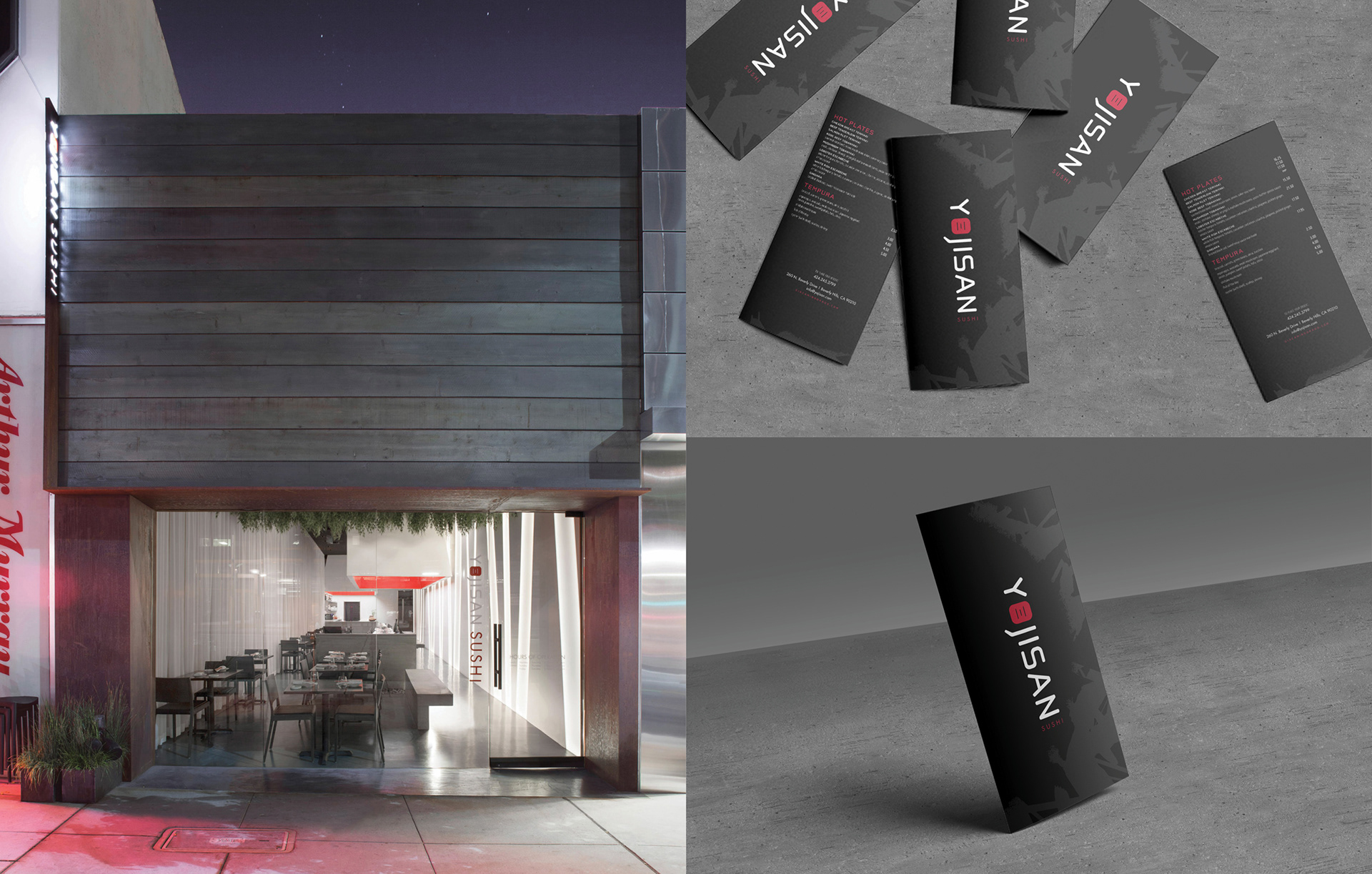
If you're opening a restaurant a stone's throw away from Rodeo Drive, Spago and Mastro's, the pressure for a top notch experience is pretty high. And when you're Chef Giacomino Drago opening up your 9th restaurant in Los Angeles? The bar is raised even higher. Along side his partner (and the restaurant's namesake), Chef Yoji Tajima, Chef Drago was ready to introduce a unique Japanese concept to the posh neighborhood – he just needed a brand identity to match.
The Result
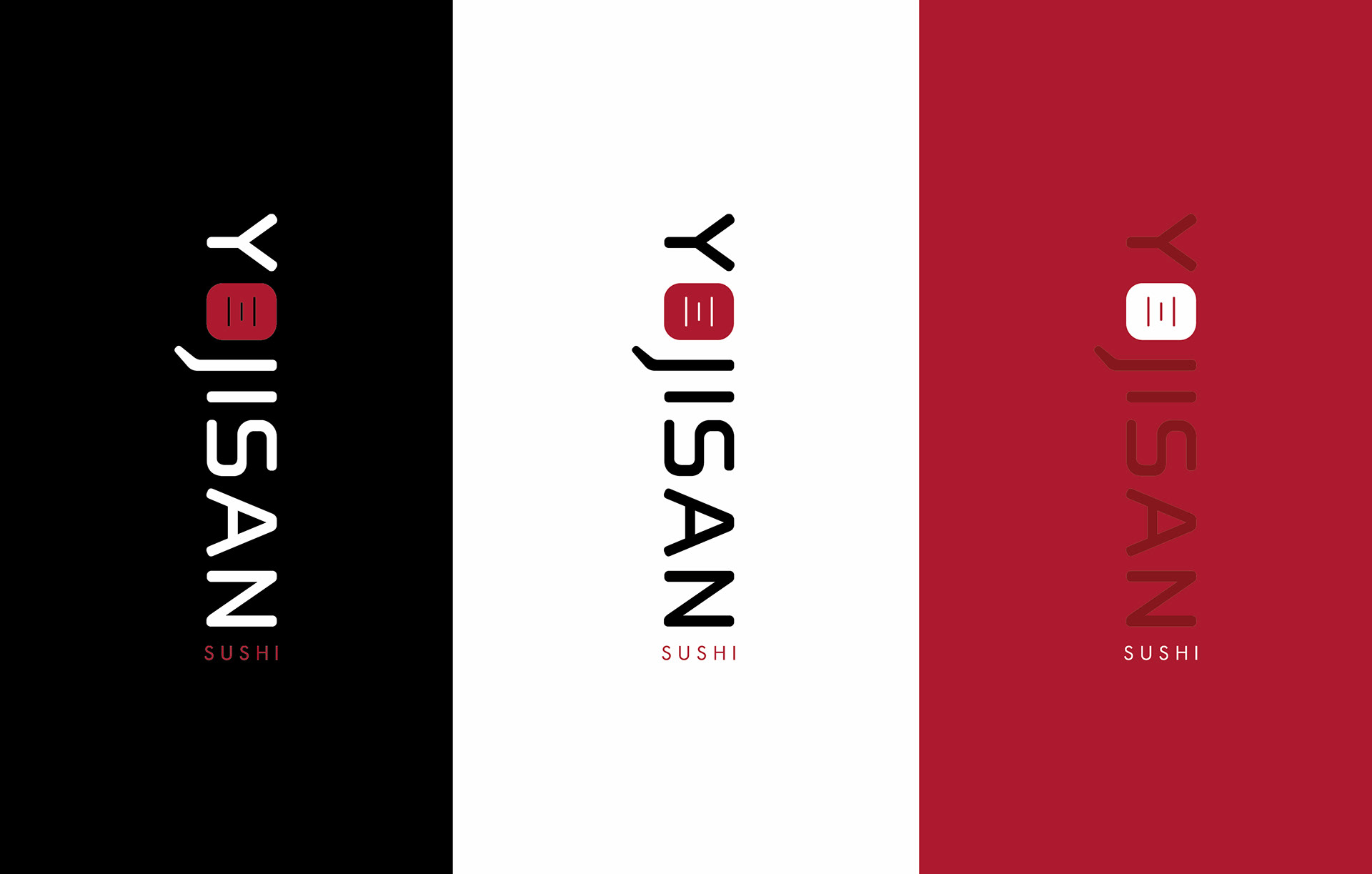
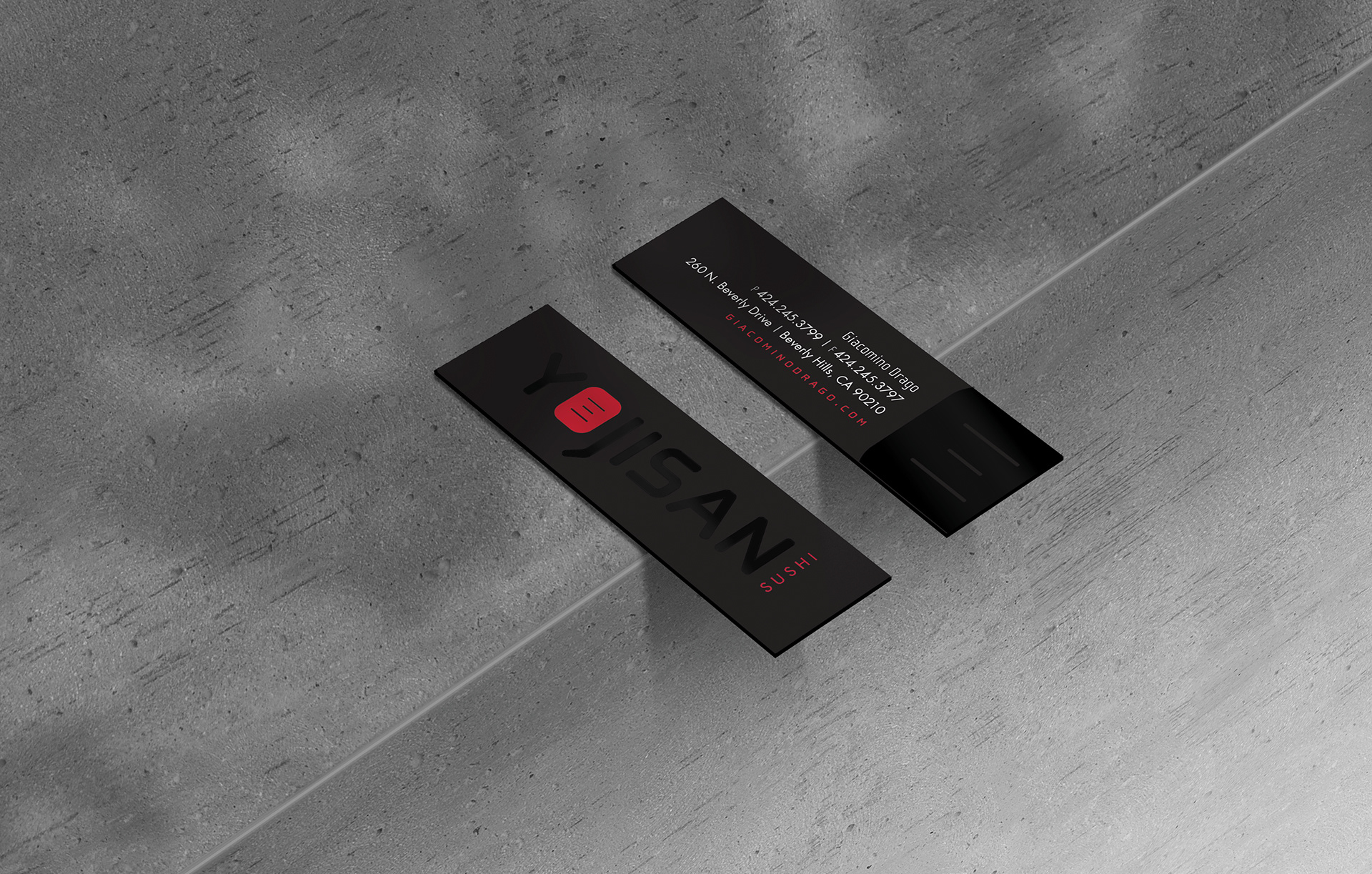
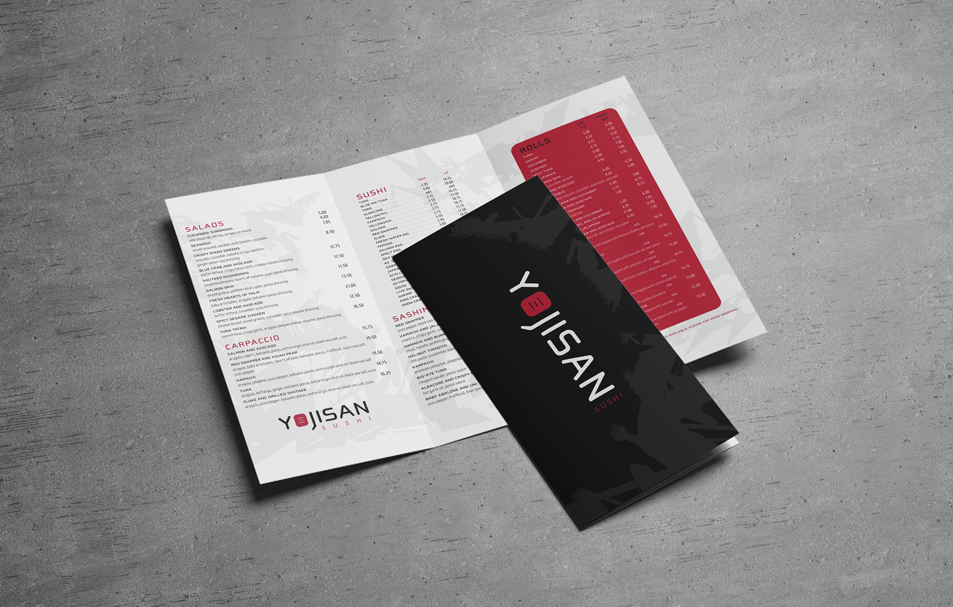
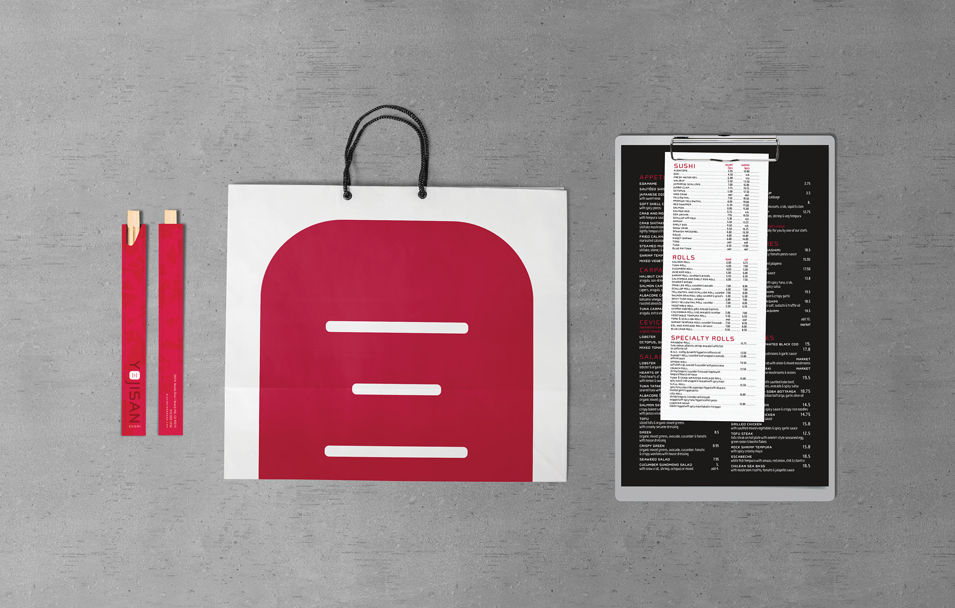
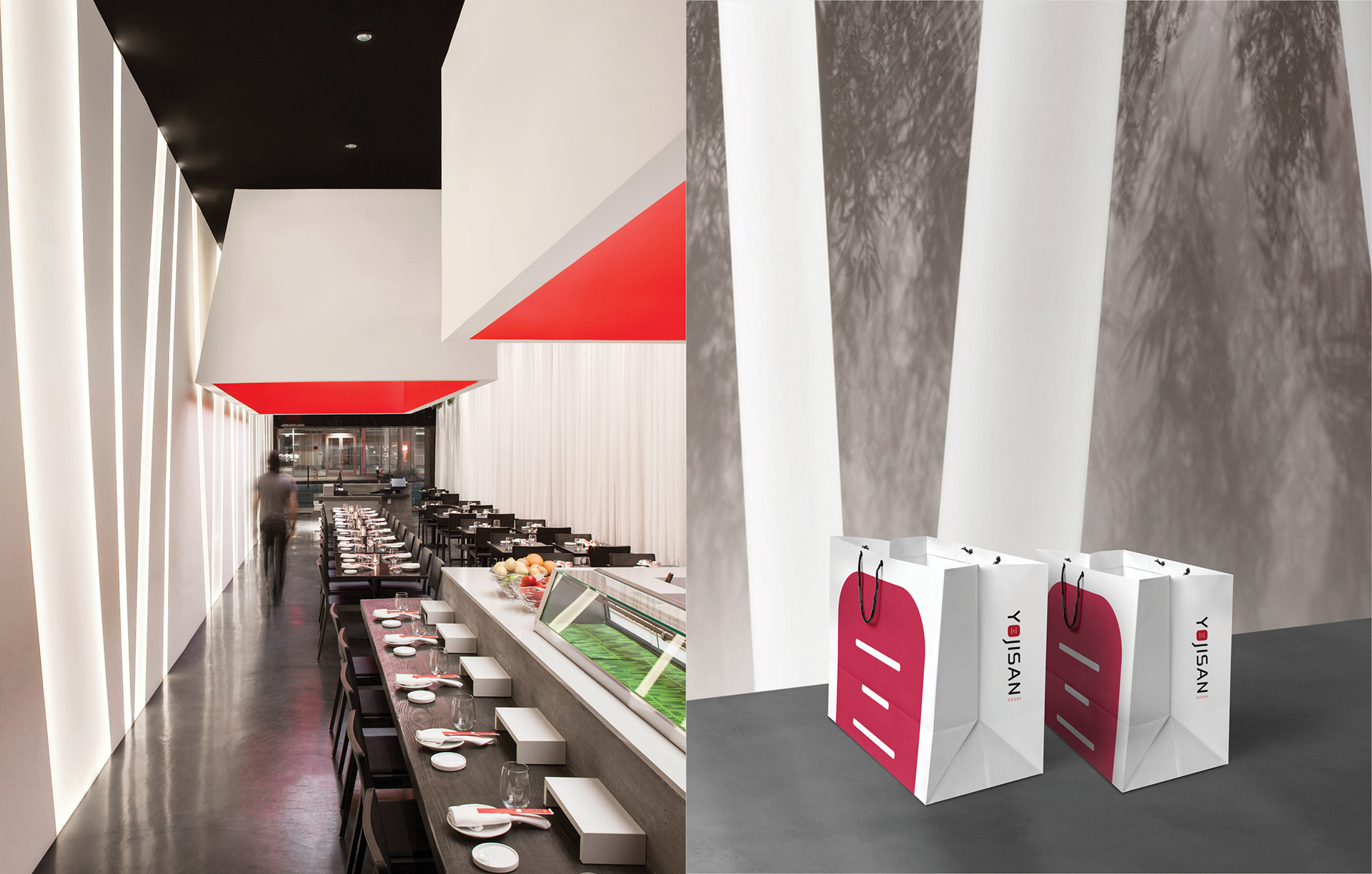
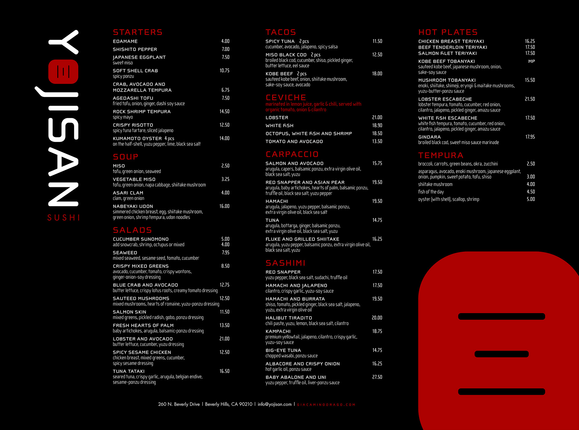
The Yojisan brand was made to complement two things: the restaurant's sleek interior and Chef Yoji's one-of-a-kind creations. We used a modern, eastern-inspired typeface, the kanji for "san," and a high contrast color palette (which includes a vibrant "bento box red" from the ceiling) so the identity truly encompassed the experience in an instant. Pieces were designed with UV spot coating, rice paper substrates and faux shadows from the floating garden to mimic the experience inside the Beverly Drive space.
Role
Brand Identity
Credits
Agency: SIX DEGREES LA
Architect: Dan Brunn
Architecture Photography: Taiyo Watanabe